Edits
A design system for Instagram’s video editor
Edits is Instagram’s app for making video: a camera, an editor, and insights for creators in one place. I designed and built its design system — the foundations and components the app is assembled from.
| Role | Design Engineer |
|---|---|
| Scope | Design system |
| Platform | iOS and Android |
| Timeline | August, 2025 |



Two interfaces in one app
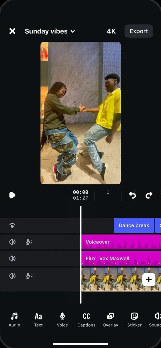
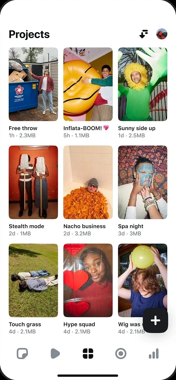
Edits is two apps in one. The camera, the editor, and the inspiration feed are creative surfaces: full-bleed video with dense controls laid over it, where every pixel of chrome competes with the frame. Projects, ideas, and insights are an ordinary app: lists, cards, and charts that a creator scans between edits.
One system had to serve both without splitting in two. The same tokens and components run through each, so moving from the timeline to a project list still feels like one product.
It’s built in three layers. Foundations define color, type, and scale. Components cover the common interface. Templates codify the parts only Edits has, like the timeline and the camera.
Foundations
Everything here was built from scratch for Edits, on top of IGDS, Instagram’s design system: the same 4-point baseline, and colour roles mapped to its semantics, so Edits feels like Instagram from the first screen.
Extended palette
Everything starts from Extended palette 2.0: eleven ramps of sixteen steps, from 1600 down to 100, with the IG brand colours at 900. It rebuilds the gray ramp from Black to Gray 100, and every step is documented with its contrast against black and white, with a mapping from the previous scale.
| 1600 | 1500 | 1400 | 1300 | 1200 | 1100 | 1000 | 900 | 800 | 700 | 600 | 500 | 400 | 300 | 200 | 100 | |
|---|---|---|---|---|---|---|---|---|---|---|---|---|---|---|---|---|
| Gray | ||||||||||||||||
| Indigo | ||||||||||||||||
| Purple | ||||||||||||||||
| Lavender | ||||||||||||||||
| Rose | ||||||||||||||||
| Pink | ||||||||||||||||
| Red | ||||||||||||||||
| Orange | ||||||||||||||||
| Yellow | ||||||||||||||||
| Green | ||||||||||||||||
| Blue |
Extended palette 2.0
Color by role
Every color in Edits is named for what it does rather than what it looks like: text and icon, background, border, status. A background can be primary, elevated, or blurred — text can be primary, secondary, or a link. Each core token has weaker steps for quieter states, and the whole set is documented against Instagram’s existing semantics so the two systems stay in step.
| Group | Role | Light | Dark |
|---|---|---|---|
| Text and icon | Primary | Black | Gray 100 |
| Secondary | Gray 900 | Gray 700 | |
| Link | Indigo 1200 | Indigo 600 | |
| Borderless button | Indigo 1100 | Indigo 700 | |
| Inverse | Gray 100 | Black | |
| Background | Primary | White | Black |
| Secondary | Gray 300 | Gray 1400 | |
| Elevated | White | Gray 1500 | |
| Blur | Gray 100 · 80% | Gray 1300 · 50% | |
| Inverse | Gray 1500 | Gray 100 | |
| Border | Primary | Gray 1500 | Gray 100 |
| Secondary | Gray 400 | Gray 1300 | |
| Accent | Yellow 900 | Yellow 900 | |
| Tertiary | Black · 15% | White · 15% | |
| Overlay | Primary | Black · 70% | Black · 70% |
| Secondary | Black · 50% | Black · 50% | |
| Status | Alert | Red 1000 | Red 700 |
| Positive | Green 1200 | Green 900 | |
| Warning | Yellow 1100 | Yellow 800 | |
| Info | Lavender 900 | Lavender 900 | |
| Decorative | IG purple | Purple 900 | Purple 900 |
| IG lavender | Lavender 900 | Lavender 900 | |
| IG pink | Pink 900 | Pink 900 | |
| IG red | Red 900 | Red 900 | |
| IG orange | Orange 900 | Orange 900 | |
| IG yellow | Yellow 900 | Yellow 900 | |
| IG green | Green 900 | Green 900 | |
| IG blue | Blue 900 | Blue 900 |
Elevation is expressed through color rather than shadow. The main background sits at level 0, and tooltips, search fields, and media buttons step up from it, with the same logic in light and dark mode.
Type and scale
Text styles are defined for iOS and Android, from Headline 0 at 31/36 down to Body 2 at 12/16. Radii, spacing, and sizing each follow their own scale.
Radius grows with an element’s footprint. Thumbnails step from 18 on a 72dp tile down to 4 on a 20dp one, all with full corner smoothing — a nod to Instagram’s squircle — while timeline tracks keep a tight 2 for precise trimming.
Spacing follows the same 4-point baseline, from 2 to 48: the small steps set the detail inside a component, the larger ones the density of a screen.
Iconography
Around three hundred icons, each drawn on a 32-point grid, are organised into nine sets. Most exist because of video: the timeline and editing, the camera, text and captions, and sound and audio each have their own set, alongside a general set for the rest of the app.
Components
The common interface — buttons, chips, sheets, menus, alerts — follows IGDS closely. The work went into the components only a video app needs, and those are the ones here, each rebuilt from the system’s own values so it can be used, not just looked at.
Timeline and toolbars
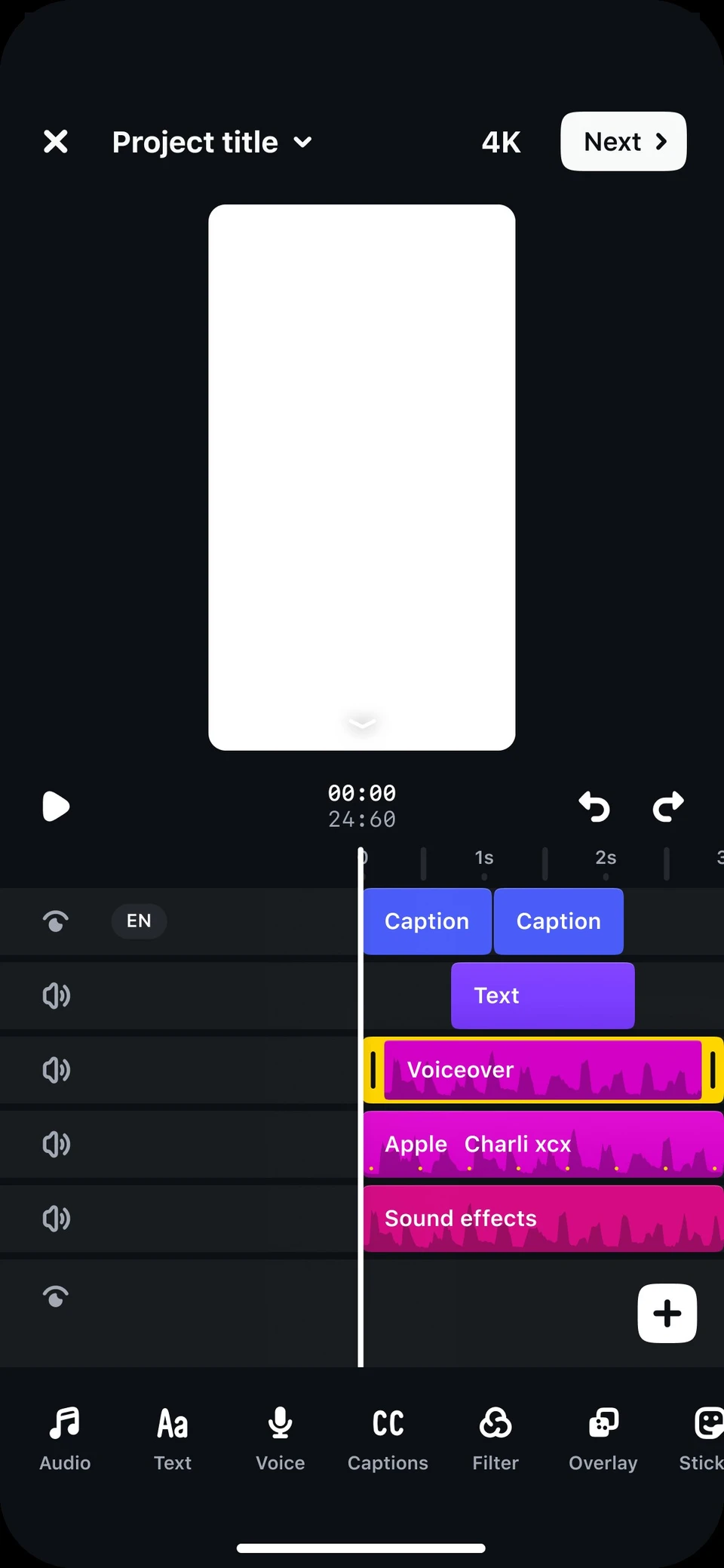
The timeline is the densest surface in the app. Every track type has its own colour — captions in blue, text in purple, music in magenta, sound effects in pink — so a project reads at a glance, and every track takes the tight 2-point radius that keeps trimming precise. The toolbar beneath follows the selection: with nothing selected it offers what can be added; select a clip and it becomes that clip’s tools. Tap a clip, or drag the playhead.
Camera controls
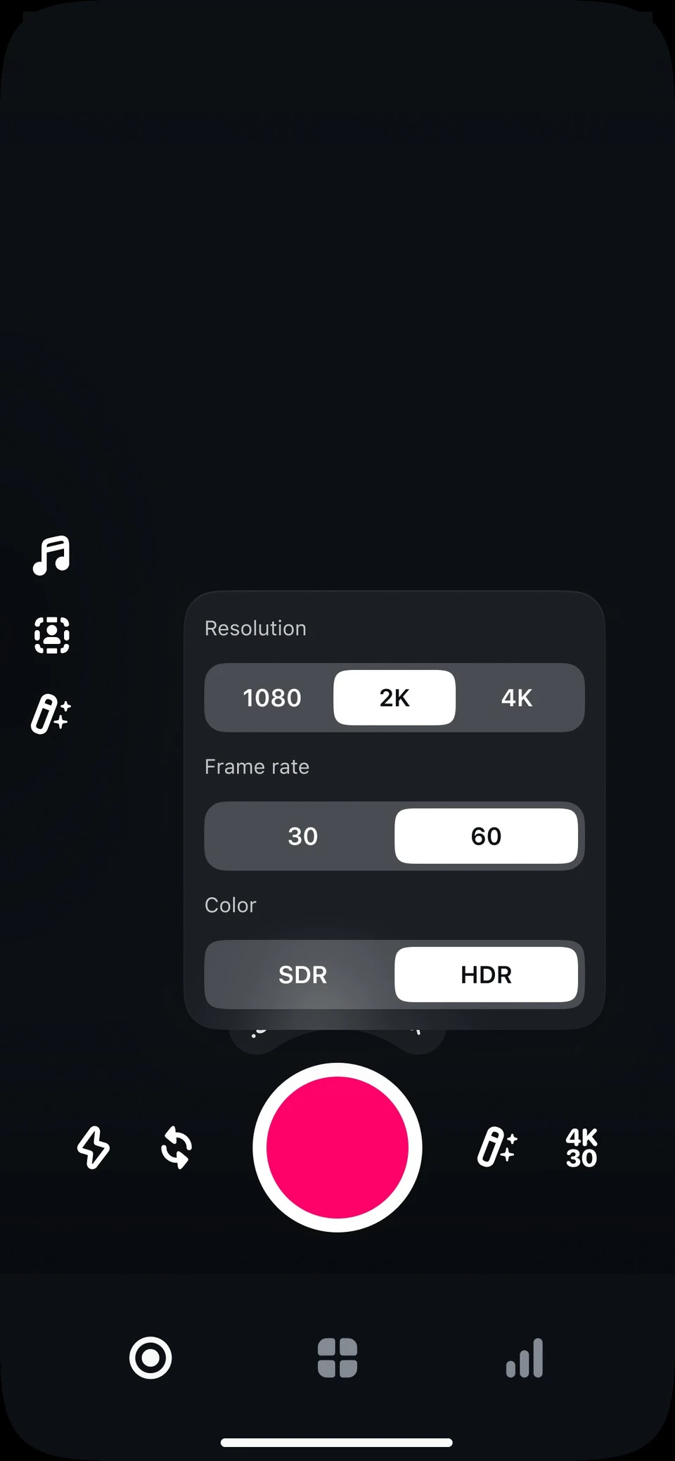
The camera’s tools — music, green screen, enhance, filters, timer and speed — share one side toolbar that opens to name them, beside the speed arc and the shutter. Open the toolbar, pick a speed, or tap the shutter.
Sliders and segmented controls
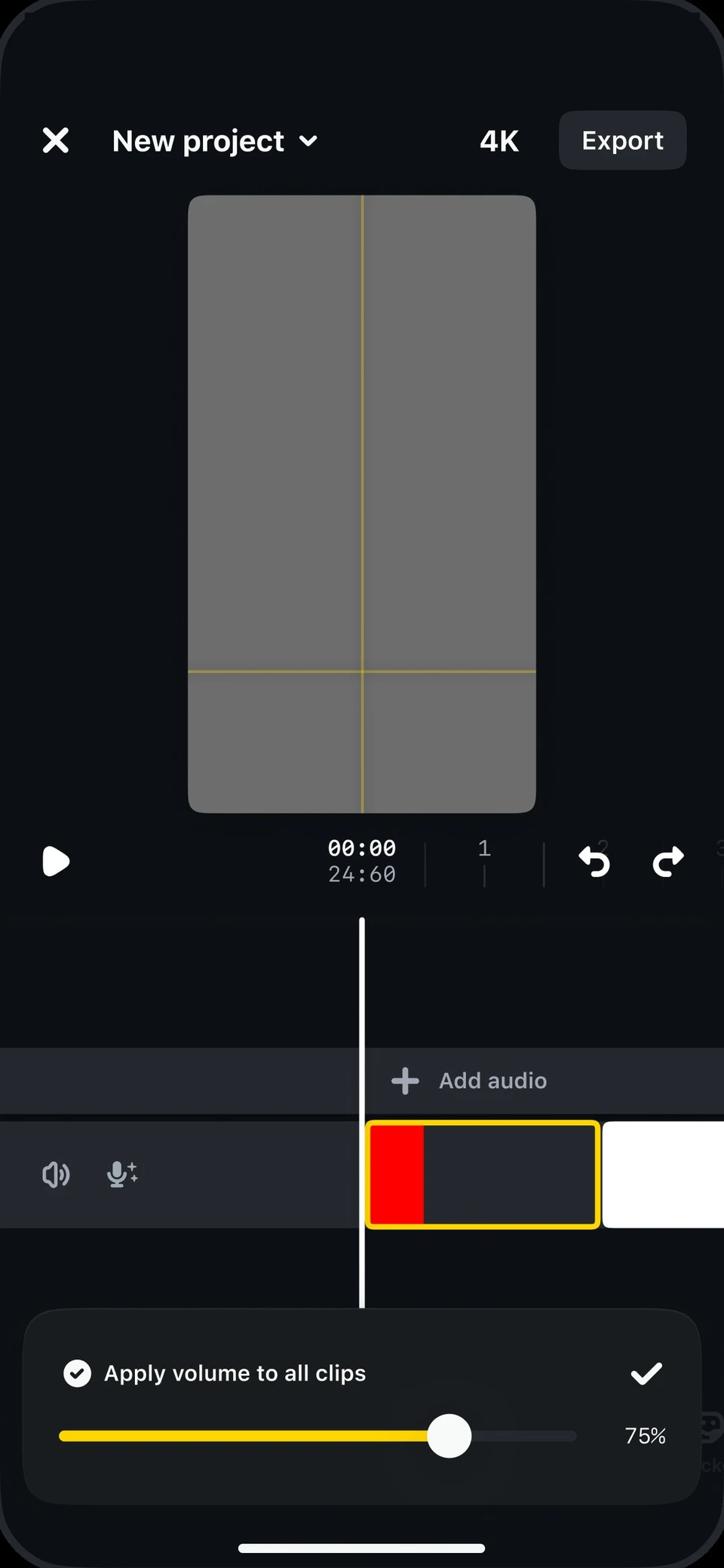
Adjustments happen on footage, so the segmented control comes in on-media and blurred variants, and the slider’s yellow fill reads against any frame.
Thumbnails
Footage appears as a thumbnail at sixteen sizes, from the timeline to the project grid. Each takes its corner from the radius scale, so a frame reads as the same object at every size.
Tab bar
Navigation was tested in several directions, including what should happen after capture. On iOS 26, the bottom tab bar becomes a floating one. Tap a tab to move the selection.


Tool NUX banner
New tools are introduced in place. A banner over the timeline names the tool in the accent yellow and says what it does, then goes once it’s dismissed.
Creative inventory
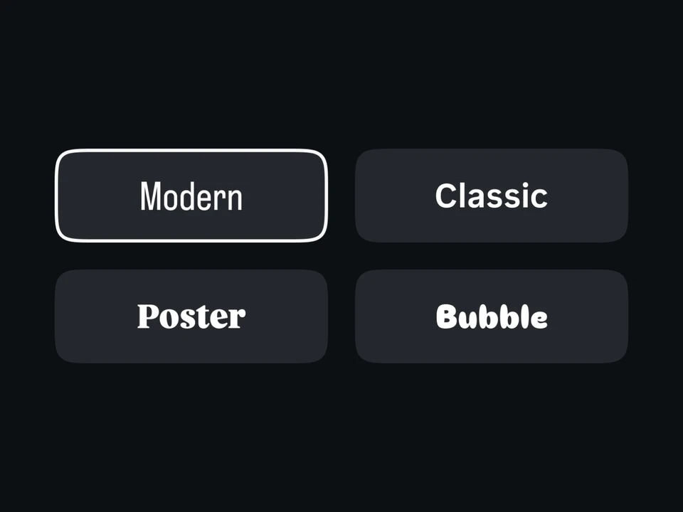
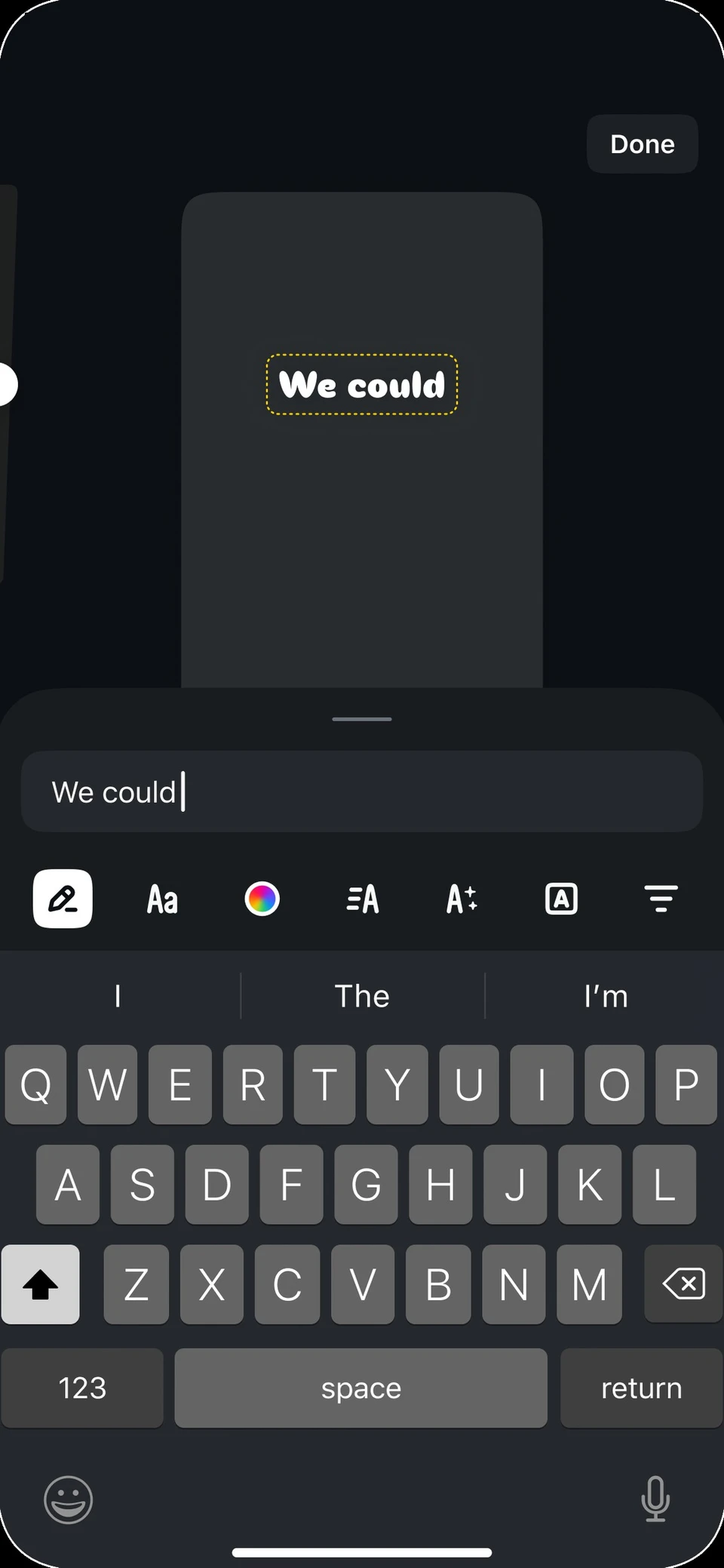
Text styles, transitions, filters, and voice effects all appear as tiles in the same grid, with tabs for saved and trending. Adding a new asset to Edits means adding a tile, not designing a new picker.
Over the video
Several exist because the content is video. A legibility gradient keeps text readable over any frame. A dimmer quiets the content behind a sheet. Media ratios standardize how footage is cropped into thumbnails and previews.
Templates
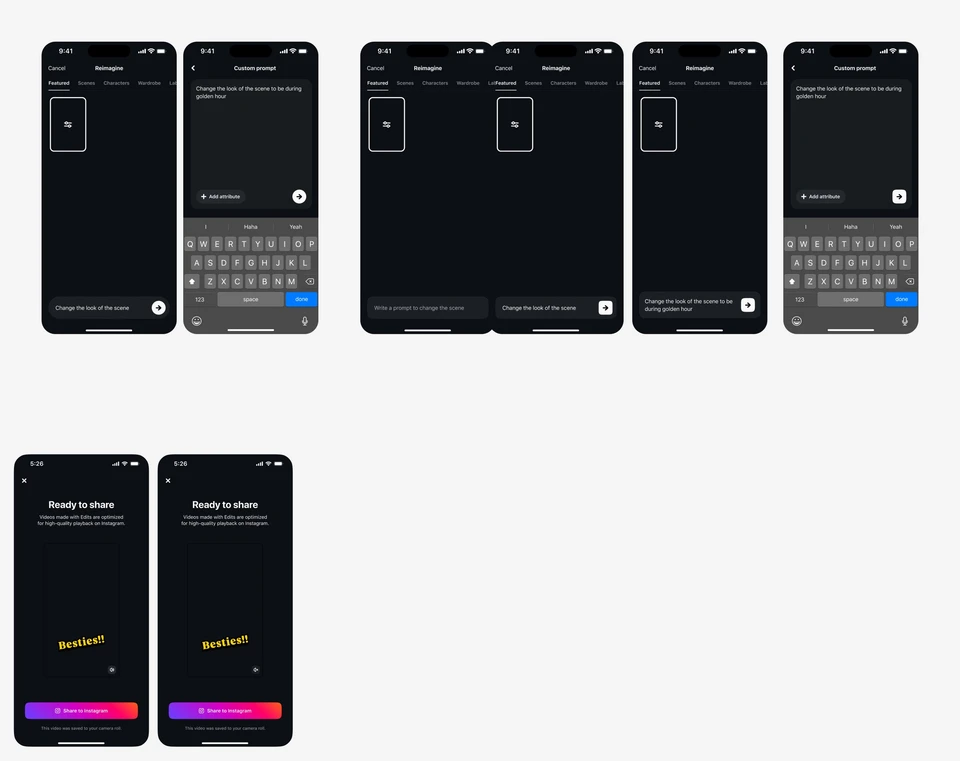
Templates are where those components become screens: the camera, the editor, captions, insights and projects. In the file they are content-free — empty thumbnails, an empty viewfinder — because a template only becomes a page when a creator’s footage fills it, as in the screens at the top of this piece.

Around the edit
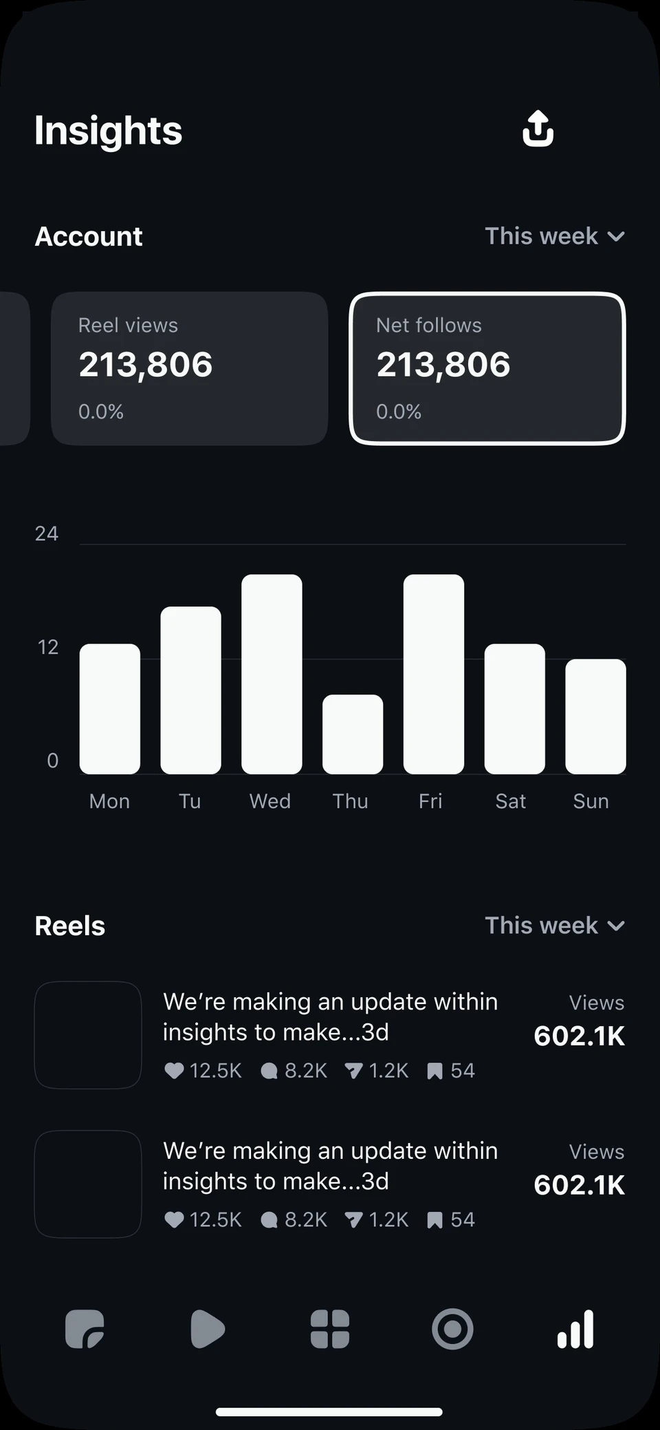
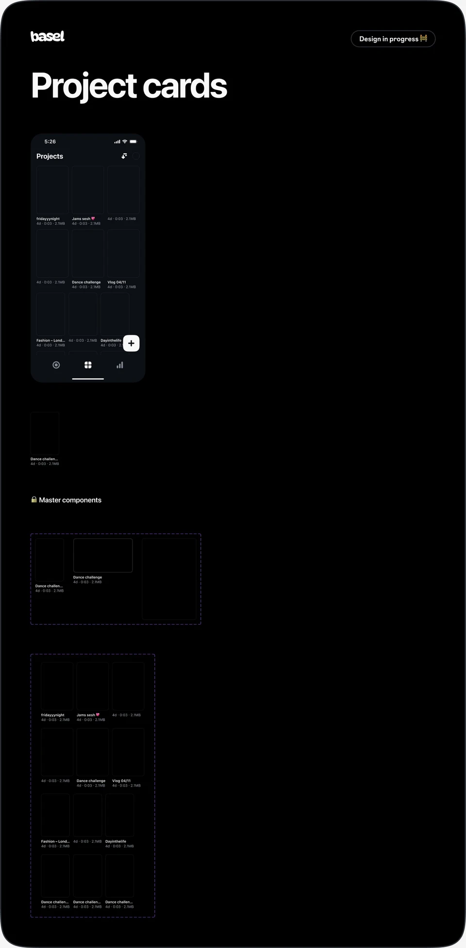
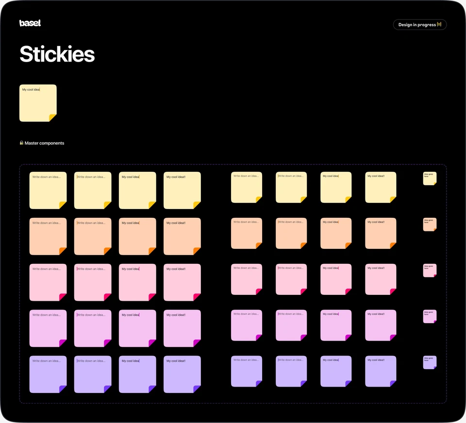
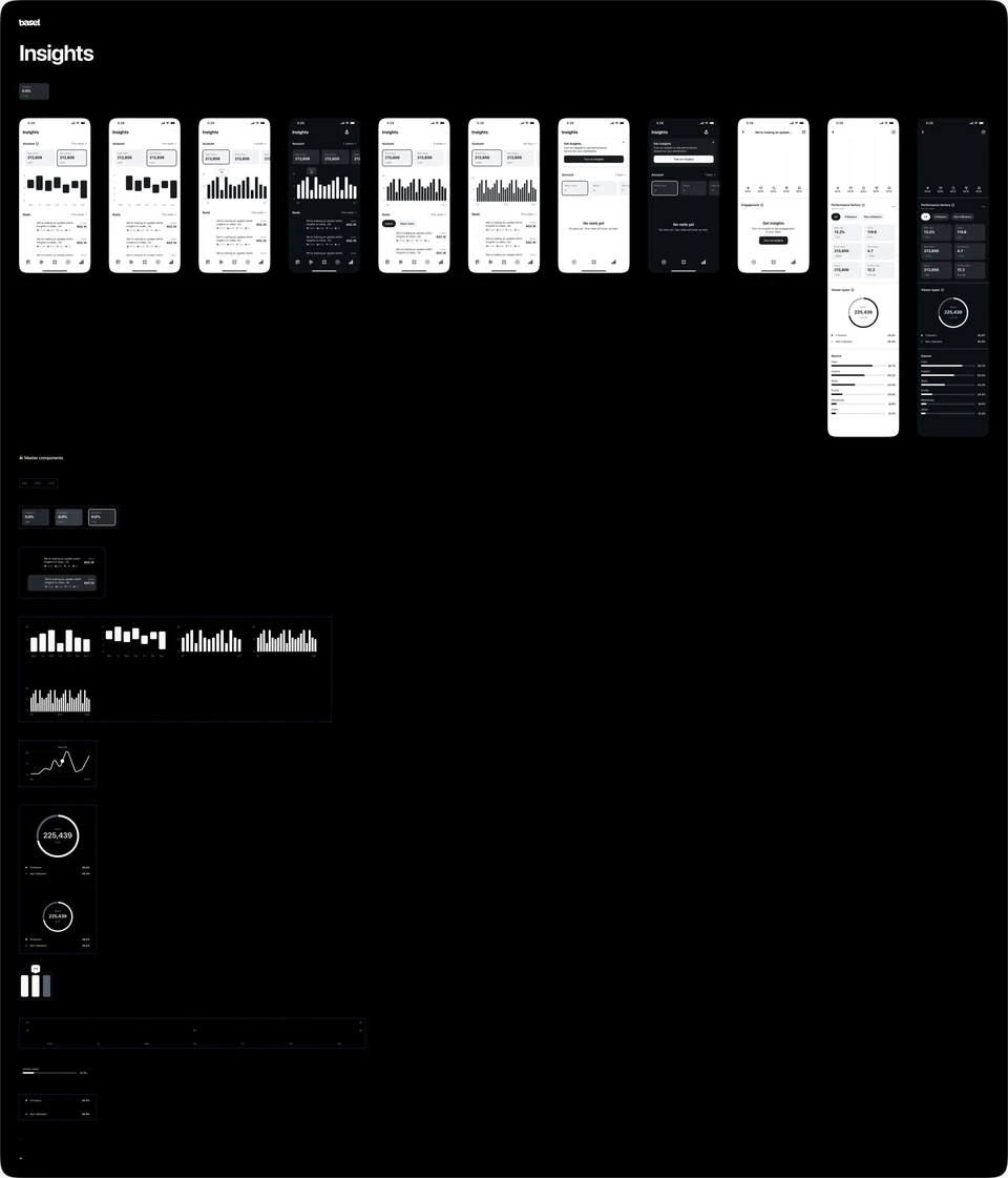
Outside the editor, the system covers what surrounds making a video: project cards, stickies for capturing ideas, inspiration built around trending audio, and Insights — reel views, follows, reach, and engagement measures like skip rate, watch time, and share rate, split between followers and non-followers.

A composer handles prompted edits: choosing a scene, character, or wardrobe to reimagine, or writing a prompt of your own, like changing a scene to golden hour.
What comes next
Much of the file is still marked design in progress. A system for a product that ships every week is never finished; its job is to make each new surface cheaper to build than the last.
The video is the product. The system’s job is to make everything around it consistent enough to disappear.