Bumble: Dating During Quarantine
March 2020
What is Bumble?
Bumble is an inclusive connection platform for people to meet. Bumble is used for dating, looking for new friends, or growing your professional network.
Setting the Stage
COVID-19 changed everything about how we live our lives, especially dating.
We, the product designers, asked ourselves how can people connect and develop a longstanding relationship with someone they’ve never met in person? And what happens when they can’t plan on meeting up for the foreseeable future?
Our goal was to design a multifaceted framework that alleviated the challenges of physical distance barriers across the end-to-end experience — in looking for potential matches, to messaging, and building a connection.
Exploring the Problem Space
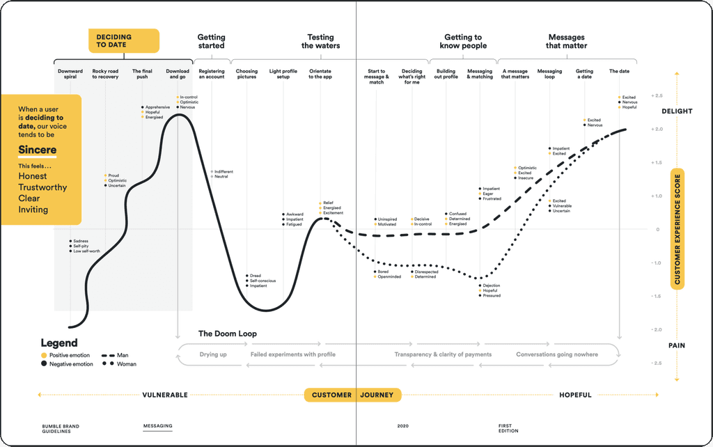
We began our ideation process by mapping the end-to-end experience of a new user’s journey through the app. We attempted to recognize where potential pitfalls may lie and how we could improve the experience.
Through this exercise, we came to the conclusion that the focal pain-points of the user experience were:
1. Account setup — experimenting with their profile
2. Swiping — time and effort required to find potential matches
3. Conversation starters — breaking the ice with a new match
Account Setup and Onboarding
Our research sessions with users indicated to us that they struggle with getting their account setup for a few reasons.
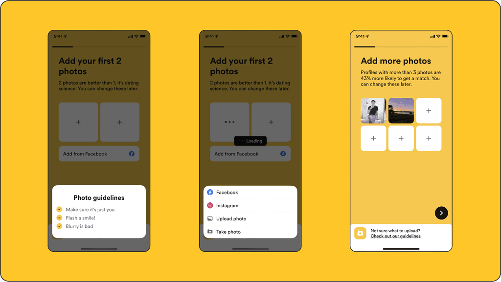
The first pain-point in getting their account setup was photo selection. Users claimed it was difficult to 1) figure out which photos would perform best, 2) scroll endlessly through their camera roll searching for the photos they want to upload, and 3) not uploading enough photos of themselves.
Our data science and research team had previously found a pattern of the photos that received the most swipes. The top performing photos had only the user in them, where the user was smiling, and the photo was not blurry. We added these guidelines as a modal to give advice during the photo upload section.
We added the ability to upload photos directly from their Facebook or Instagram accounts so that photo upload was easy, quick, and seamless.
Another problem was that users posted too few photos. Our data science and research team concluded that profiles with under 2 photos had the least amount of matches and profiles with 3 or more photos had a 43% higher chance of getting a match. By adding this fact to the upload section we increased the average photos added to a user profile by over 1 photo.
Many users had said that the main reason they didn’t message a user was due to a lack of info on a match’s profile. They had also stated that it was difficult to craft a personalized opening message due to not knowing if there were any potential areas of shared interests.
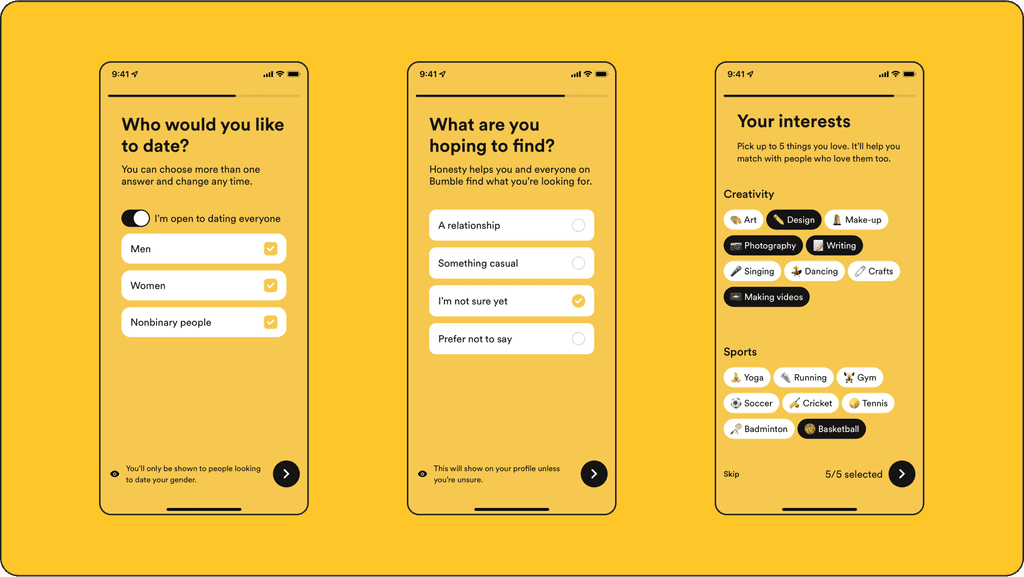
Our solution to this problem was adding an interests step during account setup. Users could select up to 5 interests based across a range of categories. We also included a progress indicator with a profile percentage completion score to encourage users to complete all of the questionnaires needed to fully setup their account and maximize the amount of public information available.
Advanced Profile Setup
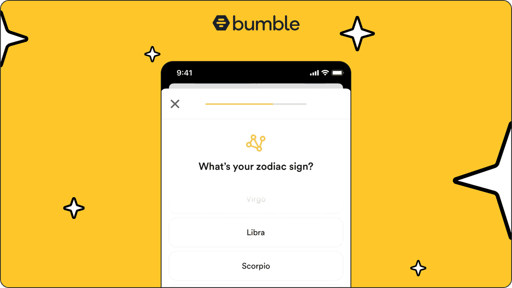
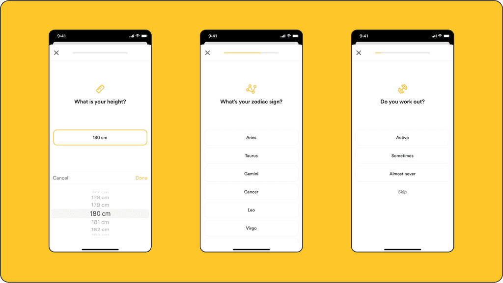
After onboarding was complete, users were given the option of adding more information to their profile. In a poll, users claimed that the top things they wanted to know about a potential match were their height, their zodiac sign, and whether or not they work out. These answers would appear on the top of a users profile.
Swiping
A member of our data science team discovered a pattern of user behavior related to swiping and coined the pattern, ‘the Rule of Thirds.’
Essentially, the Rule of Thirds is a pattern that described the relationship between swipes to matches to dates. For example, say a user swiped right 100 times on potential match profiles: on average, that user would receive 33 (or one-third) swipes right back on their profile (matches). And out of those 33 matches, only 11 (or one-third) of them develop into a meaningful conversation. And finally, only one-third of the 11 conversations would turn into dates (both physical or virtual).
This meant users were swiping a lot and getting very few dates.
The swiping behavior (swipe right to like and left to pass) is a widely known and accepted design paradigm, especially in the dating app industry. So to rethink that affordance seemed out of scope. Instead, we tried to figure out how to optimize for a higher percentage of meaningful swipes (i.e. how can we maximize percentage of swipes right and minimize swipes left).
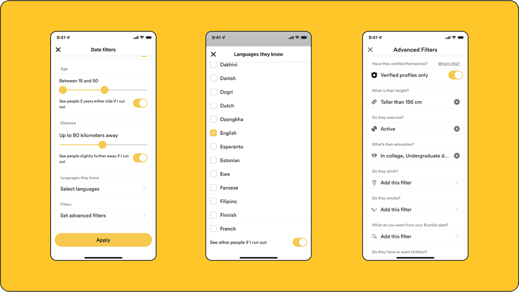
One solution was to add more filters during the account setup section so that users were shown more matches who fit their preferred type. These filters included searching on the basis of gender, orientation, ethnicity, language, proximity, and shared interests.
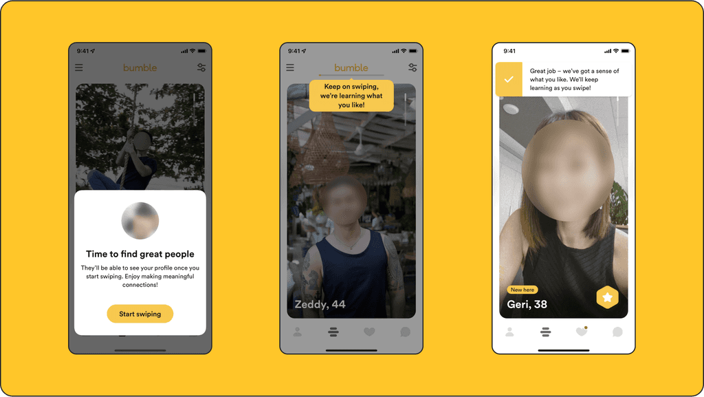
The second solution was to use a machine learning algorithm to spot patterns in the photos of your swipes right and show more people fitting that physical pattern and shared interests in the feed. During onboarding, the first 25 swipes would give the algorithm enough data to train a type to be shown more often in the feed.
Ice Breakers and Conversation Starters
The area of the user experience journey with the highest friction for users was conversation starters. To be fair, this still is a persistent issue across almost all dating apps and was not exclusive to Bumble. Nevertheless, during the pandemic, it was paramount to solve this problem because users were only able to build a meaningful connection through messaging.
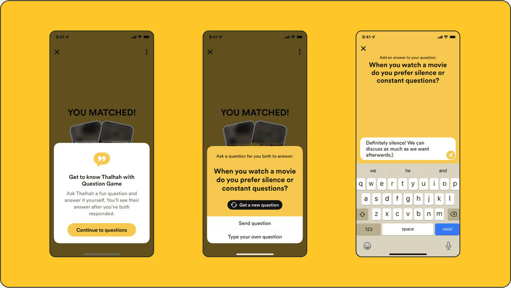
The inspiration for the question game came from a YouTube reality TV show called the Button. The premise of the show was that two people entered into a blind date sitting across from each other with an Alexa-like, AI device in the middle of the table. The device would blurt out conversation starters for the contestants on the date and both had to answer the question or lose the game.
That sparked the idea for a question-based ice breaker feature that could live within the message tool of the app. We applied similar logic to Bumble’s match making framework, whereby each user has 24 hours to respond. When both users respond, both answers are revealed simultaneously. To reduce user friction, a user could choose from as many as 25 different questions or choose their own question to ask.
Audio Messages and Video Calls
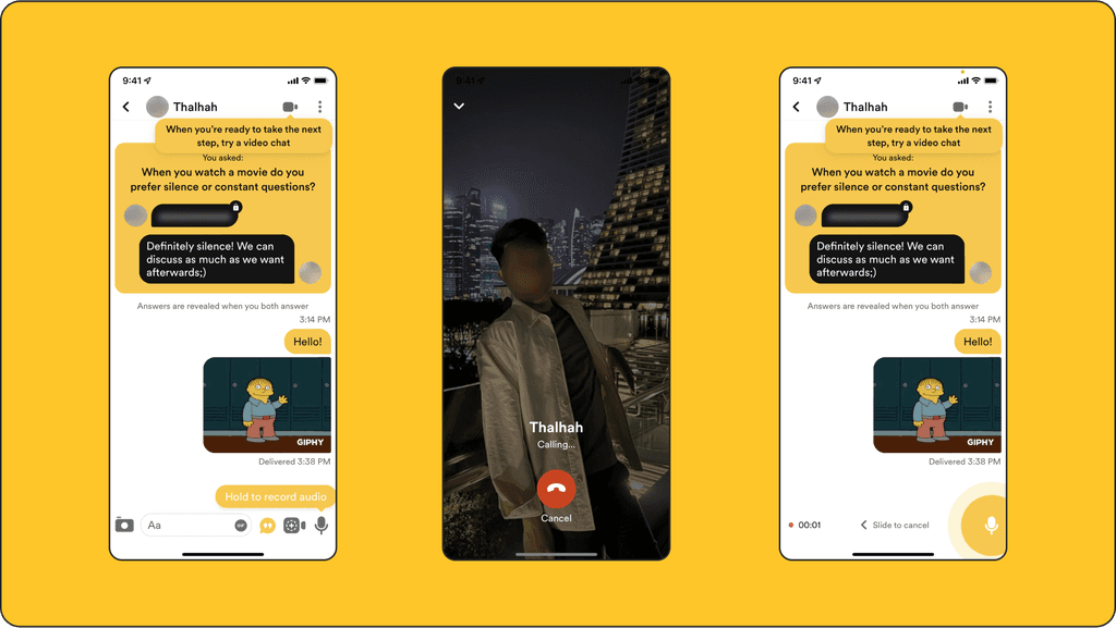
During a user research session, many users indicated that they began to feel a stronger sense of attraction to a person once they had heard their voice. This sparked the idea for including audio messages into the message section of the app. Adding audio messages increased overall sharing in the message section of the app by over 12%.
Even with all of the new features added to the account setup and messaging sections of the app, users still felt that it was difficult to develop a truly meaningful connection with a match.
Users mention they swiped, and swiped, then messages a match for a few days. Ultimately, they seemed to get bored and begin the process over again. How could we break this pattern?
After a lot of coffee, brainstorming, and more coffee, we figured out that users were beginning to feel comfortable spending a lot of time on Zoom (either for work or for school). We even noticed that some users were inviting other users on “Zoom dates.” We conducted a quick user survey and found out that many users felt comfortable about the idea of dating via video chat.
Big Win
Apple used Bumble’s new onboarding process to showcase best practices for inclusive design when soliciting personal information from new users. It was so cool to see the work be recognized. This was showcased in WWDC21 Summit. Skip ahead to 30:35.
